
When it comes to creating an effective, healthy broadband marketplace, maps are important. For us, there is no clearer truth to this than the frustrating times when we’ve been forced to take local leaders to task for claiming an inability to act on connectivity issues until every last unserved location has been mapped. In a perfect world, we’d always have accurate broadband maps. But the consequences of waiting for *the perfect map* means homes and businesses will remain unconnected for the many months it often takes to survey and build a network.
At the same time, every map is also an argument, representing a point of view. With good data, a map can be effective ammunition to dispute incumbent monopoly providers that have long abused challenge processes to prevent competition and protect their profit margins at the expense of everyday Americans.
And so, precisely because the FCC has been so ineffective in fulfilling one of its core charges - telling policy makers at every level of government where broadband is and is not - at a time of unprecedented federal investment in broadband, some states have decided to take matters into their own hands. It’s a smart move, and sets those states up for success down the road. There are many approaches to mapping broadband availability, and some are going to be better than others.
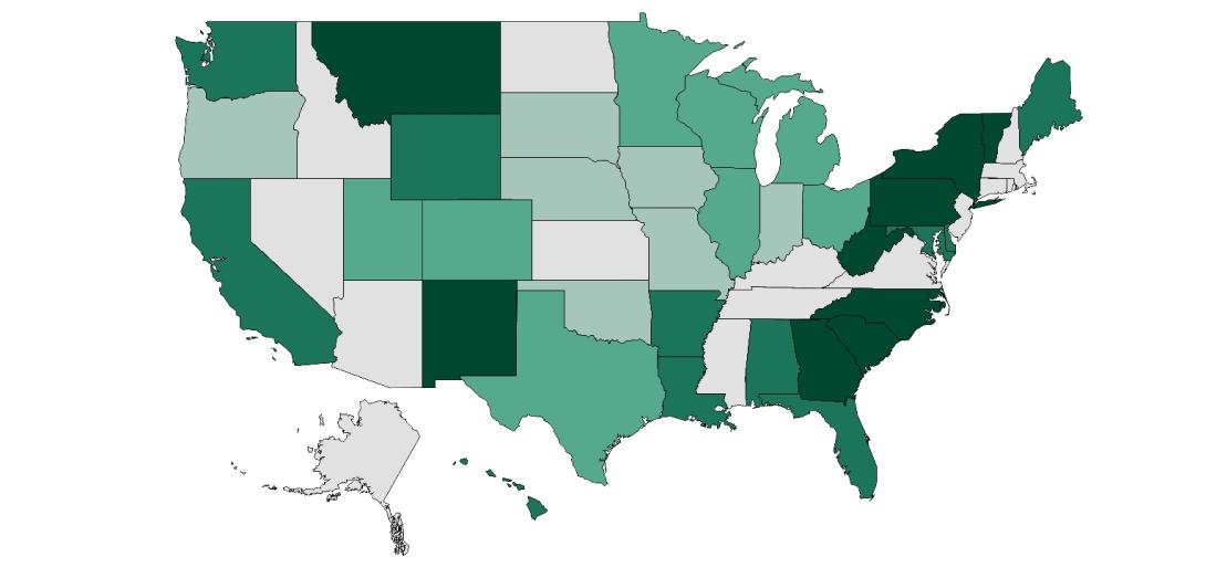
We’ve attempted to summarize where those efforts are today in a new resource: our United State(s) of Broadband Maps. It shows the variety of ways states are pitching in to gather data to drive policy and investment. Read our longer discussion of the new FCC Fabric and explanation of the various state broadband mapping efforts here.
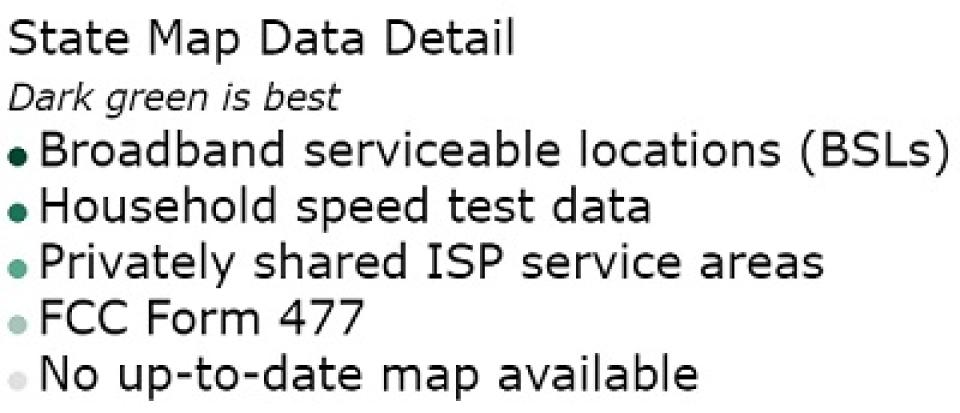
Dark green represents those states we think are doing the best job. Lighter shades of green represent less precise, complete, or useful data in deploying new broadband infrastructure efficiently. In general, we believe the states in the top two categories will be much better poised to effectively use public dollars to drive investment towards more efficient, practical solutions.
Gray represents those states that have no up-to-date map of broadband availability shared publicly. We believe that if these states continue to wait for the FCC to provide a faithful broadband map before they can effectively use federal money, those living in cities and rural areas alike will fall behind compared to their fellow citizens across the nation.
This resource will be updated regularly, and we welcome any updates from states as they begin or change their mapping process. Updates can be shared with ILSR GIS and Data Visualization Specialist Christine Parker, at christine@ilsr.org.
Dark green represents those states we think are doing the best job. Lighter shades of green represent less precise, complete, or useful data in deploying new broadband infrastructure efficiently. Gray represents those states that have no up-to-date map of broadband availability shared publicly.
Click on the link below to view an interactive version of the map. Each entry contains a description of the data that state used to create its broadband maps, as well as links to the maps themselves.
See a full-screen version of The United State(s) of Broadband map here.
Or, view and download an HTML version of the map here. To view, open it in any web browser.
*If at any point the HTML file stops working, it's because the map has been updated. Just return to this story or that dropbox folder and redownload the file at the link above.
The methodology and data used to create this map can be found on ILSR's GitHub page here.
This resource will be updated regularly, and we welcome any updates from states as they begin or change their mapping process. Updates can be shared with Christine Parker at christine@ilsr.org.

