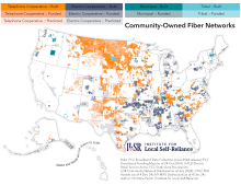
At their core, maps are about using data to tell a story. And we may be biased, but we love a good map about the Internet around here. Hexes, polygons, availability maps: they're all equally good. Whether in service to educating the public, or making a policy point, or helping local leaders make more informed choices as they work for the collective good, maps can be a powerful tool.
Every year since 2018, mapping gurus from the United States and around the world have come together to have some fun by putting together 30 maps in 30 days. Different types of maps and conceptual frameworks invite both builders and viewers to look at the world in new ways, and have some fun along the way.

ILSR is joining in this year, and throughout the month of November we'll be releasing a new map every day showing featuring Internet infrastructure and digital equity in news ways. See the categories above.
Every day we'll publish a new map about the Internet, and post them to our StoryMaps page. The first is already live: showing mobile wireless towers in and around Phoenix, Arizona, that have been disguised to look like something else.
Got an idea for a map we should make? Email is at broadband@communitynets.org.
P.S. Maps about the Internet are nothing new: Vox collected 40 Maps About the Internet all the way back in 2014 (my favorites are numbers 8, 18, and 32).


